2 Prong Tree
TrueTypeFreeware
2PROT___.TTF
Tags
Author's note
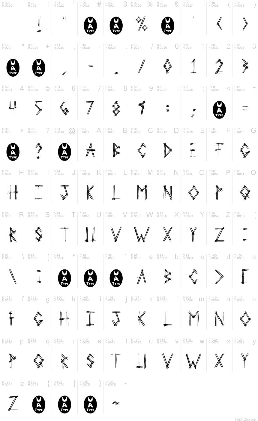
2 Prong Tree is a captivating script font designed by Ben McGehee. With its bold, angular strokes and distinctive "tree-like" shapes, this typeface exudes an undeniable sense of edginess and unconventionality. The "trash" style lends it a raw, gritty aesthetic that would be well-suited for album covers, concert posters, and other high-impact design projects.
The font's striking visual identity makes it a versatile choice for a wide range of applications. Its dynamic, almost kinetic appearance could breathe new life into branding initiatives, while the font's bold, assertive personality would complement experimental typography and digital art. Whether employed for headlines, logotypes, or decorative accents, "2 Prong Tree" promises to leave a lasting impression on viewers.
The font's striking visual identity makes it a versatile choice for a wide range of applications. Its dynamic, almost kinetic appearance could breathe new life into branding initiatives, while the font's bold, assertive personality would complement experimental typography and digital art. Whether employed for headlines, logotypes, or decorative accents, "2 Prong Tree" promises to leave a lasting impression on viewers.
Character map
Please use the pulldown menu to view different character maps contained in this font.

Basic font information
Copyright notice
Another Freeware font from UnAuthorized Type
Font family
2 Prong Tree
Font subfamily
Regular
Unique subfamily identification
Macromedia Fontographer 4.1 2 Prong Tree
Full font name
2 Prong Tree
Name table version
1.0 (5/24/97)
Postscript font name
2ProngTree
Trademark notice
UnAuthorized Type
Manufacturer name
Designer
Description
This version includes only capital letters, and some commonly used punctuation. plus the new UA Type dingbat (just to amuse myself).
When I was sitting in Huddle House one night, drinking coffee, I was showing my girlfriend the fonts I was working on. I drew out 3-Prong Tree, and she said that she didn't like it. She told me to do it with just 2 lines on every letter. So I tried that with this one.
She realized after the finished product of 3-Prong Tree that it was good, but I went on and did 2-Prong Tree just to see the difference. 3-Prong looks better at smaller point sizes (because it's fatter), but 2-Prong Tree looks better at larger point sizes (because the letters are cleaner).
Extended font information
Platforms supported
PlatformEncoding
MicrosoftUnicode BMP only
MacintoshRoman
UnicodeUnicode 1.0 semantics
Font details
Created1997-05-24
Revision1
Glyph count110
Units per Em1000
Embedding rightsEmbedding restricted (not allowed!)
Family classScripts
WeightSemi-light
WidthSemi-condensed
Width typeNormal
Mac styleBold
DirectionOnly strongly left to right glyphs + contains neutrals
Pattern natureRegular
PostureUpright
Stroke weightBook, text, regular, etc.
PitchNot monospaced
Symbol setWindows 3.1 ANSI