line-phone-font
TrueTypePersonal use
Line phone font.ttf
Tags
Author's note
Connect:me@tianfei.info
http://tianfei.info | http://deslabs.info
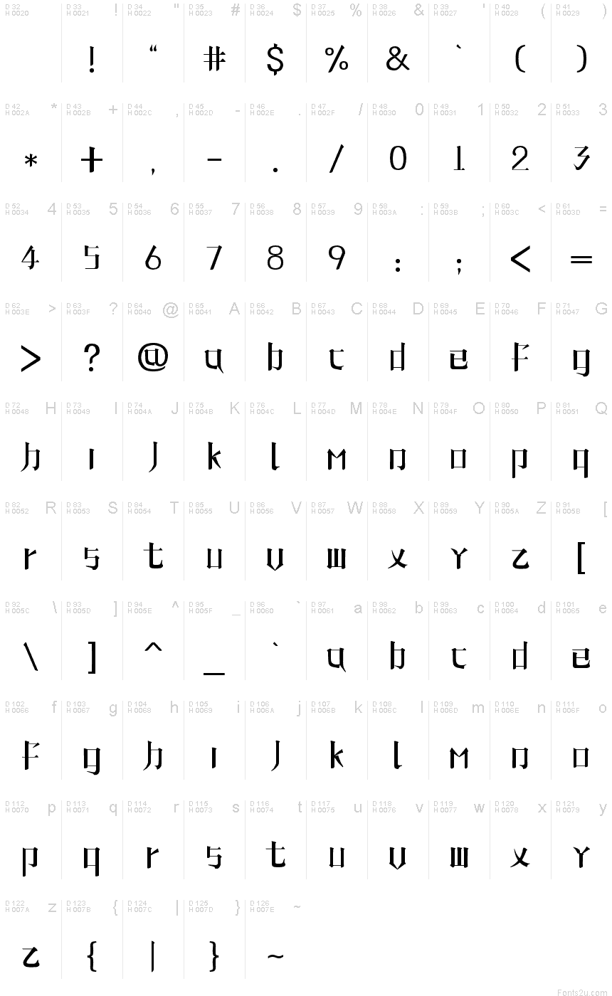
"Line phone font"是一款英文字体,又名"Song Stroke"(宋意笔划体)。是取自中文 大宋体的æ„趣,抽å–了ä¸æ–‡çš„æž„æˆç‰¹å¾ï¼Œä»Žè€Œäº§ç”Ÿä¸€ç§ç‹¬ç‰¹çš„视觉效果。
在字母的设计中,我希望每一笔,都尽可能的接近中文笔划的特点。而不是简单的将中文笔划进行变形,旋转,或者镜像等等。从b,p,d,q这几个字母的设计中能体现出我们的一些想法。
"Line Phone Font"的设计原则是:
1、每个字母都是单独的完整的图形,从视觉上应该是统一的而不是分离的。
2ã€å°½é‡è¿½æ±‚æ¯ä¸ªç¬”划都æ¥è‡ªåˆç†çš„ä¸æ–‡è§£æž„。
3ã€åå¤æµ‹è¯•ä¹‹æ¯ä¹‹é—´çš„é—´è·ç»„åˆã€‚
Translation form google
Line phone font "is a font of English, also known as" Song, the Stroke "(Song intended to stroke the body). Is taken from the charm of the Chinese "Arial", sample of the composition characteristics of the Chinese, resulting in a unique visual effects.
In the design of letters, I hope each, are as close as possible to the characteristics of Chinese strokes. Rather than a simple Chinese strokes deformation, rotation, or mirror, and so on. B, p, d, q and a few letters of the design to reflect some of our ideas.
"Line Phone Font" design principle is:
1, each letter is separate graphics from the vision should be uniform rather than separation.
2, as the pursuit of each stroke from the Chinese deconstruction.
3, repeated combination of the spacing between the test the mother.
Character map
Please use the pulldown menu to view different character maps contained in this font.

Basic font information
Copyright notice
Typeface © . 2011. All Rights Reserved
Font family
Line phone font
Font subfamily
Regular
Unique subfamily identification
Line phone :Version 1.00
Full font name
line-phone-font
Name table version
Version 1.00 September 5, 2011, initial release
Postscript font name
line-phone-font-
Description
This font was created using the Font Creator Program 4.1 from High-Logic.com
Extended font information
Platforms supported
PlatformEncoding
UnicodeUnicode 2.0 and onwards semantics, Unicode BMP only.
MacintoshRoman
MicrosoftUnicode BMP only
Font details
Created2011-09-05
Revision1
Glyph count102
Units per Em2048
Embedding rightsEmbedding for editing allowed
Family classNo classification
WeightSemi-light
WidthMedium (normal)
Mac styleBold
DirectionOnly strongly left to right glyphs
Pattern natureRegular
PitchNot monospaced